
Application component
The kit:app component is an root layout for all component Lapikit. It acts as a global provider, initializing and centralizing everything Lapikit needs to function properly.
Role of the App component
- Provides and configures global blinds (design system, density, etc.)
- Manages the overlays stack (modals, menus, toasts…)
- Applies global CSS (theme, reset, normalize, etc.)
- Ensures proper contextual operation of Lapikit components
In Lapikit, the kit:app component serves as the entry point for all Lapikit child components. It operates on the principle of inheritance and ensures a simple and, above all, comprehensive layout across all components. Effects (overlays, multi-modal, etc.) are managed exclusively by kit:app to ensure the correct positioning of each element in your window and to avoid potential conflicts during the creation of your application.
The
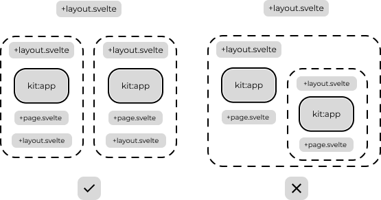
kit:appcomponent cannot itself be a child of anotherkit:app
If you’re using SvelteKit, you can rely on the layout system. Each main layout can have its own kit:app configuration. Lapikit supports multiple configurations as long as you clearly define a separate configuration with variables and styles specific to each one. In principle, incrementing kit:app won’t crash your project, but it can cause duplications and conflicts in styles and assets (overlays, multi-modals). If you’re comfortable with the risk, it’s up to you.
Example to use kit:app
To get started or continue your project with Lapikit, define the entry point where Lapikit components will be used. The most common approach is to initialize them directly in your project’s root +layout.svelte file.
Without preprocess Lapikit
If you aren’t using the Lapikit preprocessor in svelte.config.js, you can import it the usual way with:
API References
Root
| props | type | description | default |
|---|---|---|---|
| ref $bindable | HTMLElement | Bindable reference to the rendered DOM element. | null |
| s-class | enum'string''array''object' | Sets className on app. | |
| s-style | enum'string''array''object' | Sets styles on app. | |
| children | Snippet | undefined | Child content to be displayed in kit:app. | undefined |
Then you can explore basic components like Button, Card or Dialog to enrich your kit:app.